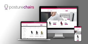
Over the past nine months we have been advising people just how important it is to have a responsive website. Well, it’s now more important than ever that your website has web pages that are mobile-friendly following Google’s most important algorithm update for years.
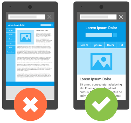
Google’s Mobile-Friendly Algorithm came into effect on April 21st and, in simple terms, Google will now favour web pages that are optimised for mobiles and tablets over web pages that are only designed to display on a desktop device.
Some of the factors that will affect how your website’s pages rank are:
- how legible text is without having to tap or zoom
- tap targets such as links and images are spaced appropriately
- the page avoids horizontal scrolling
- the page doesn’t have unplayable content or unusable features
So how will this affect your own website?
Well, if you already have a mobile-friendly or responsive website then the good news is your website could start appearing further up the Google search results page, particularly if your industry competitors don’t currently have a mobile-friendly or responsive website. Of course, conversely, if you don’t yet have a mobile-friendly or responsive website then you could start slipping down the Google search rankings.
Either way these changes won’t have happened overnight. In fact it could take several weeks for the impact to take effect but believe us, it will happen.
You can check the current mobile-friendliness of your website’s homepage using Google’s Mobile-friendly Test Tool.
There are several important factors to consider before contacting your web developer…
The Google update only affects search rankings from searches made on mobile devices
This means that if your competitor has a mobile-friendly website they won’t rank above you if the user is searching on a desktop PC, Mac or laptop etc. They may only outrank you if the user is searching on a smartphone or tablet. This is probably the most important fact when considering the urgency of moving to a responsive website.
For example, if you have a business to consumer business investing in a new mobile-friendly responsive website that is going to appeal to your current and potential customers, and keep you ahead of your competitors, will pay early dividends. Whereas if your target audience is other businesses then there may not be an immediate need to roll out a mobile-friendly website, if most of your clients are based in offices and generally use a desktop machine. However, it is also important to consider that mobile internet usage is constantly on the rise and many of the individuals within your target businesses may use mobile devices at work or while commuting to deal with business activities.
The Google update only applies to individual pages, not entire websites
While this fact is entirely true it is also quite misleading. Yes, the update only applies to web pages, not entire websites, but a website is essentially a collection of multiple web pages. So, if every page throughout your website is mobile-friendly by default then there’s nothing to worry about. This is just one of the many benefits of a having a responsive website – as any new page created will be mobile-friendly.
Tablets ARE mobile-devices
There has been some debate as to whether tablets, such as iPads, are considered to be mobile devices. While usage research suggest most individuals use their tablets to surf the web at home, they are still portable devices and their screen size and resolution means that web pages will display differently on them compared to a desktop device. So, having a mobile-friendly website means having a website that caters to both mobile phone and tablet users.
The Google update affects search results in all languages globally
A level playing field worldwide. There’s a first.
Content is still king
While the mobile-friendly change is important, Google will still use a variety of signals to rank search results – including the quality of content in relation to the search query. So, even if a page with high quality content is not mobile-friendly, it could still rank high if it has content that is relevant to the search.
If you want to keep up with, or even get ahead of, your competitors online, at Vizulate Digital we can help. We build device responsive websites as standard, meaning every website, and therefore every web page, we create is mobile-friendly from the word go. In fact we’re pleased to say that every single page of our clients’ current websites passed Google’s mobile-friendly test, without any amendments.
For more information on our mobile-friendly responsive websites contact us today on 01484 950 200 or email us at info@vizulate.com
About Vizulate Digital
Vizulate Digital is a digital marketing and web design agency based in Brighouse on the outskirts of Huddersfield and Calderdale. We provide mobile-friendly and responsive website design, e-commerce development and digital marketing solutions for businesses looking to grow online.