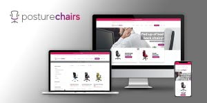
The field of Responsive Website Design (RWD) 10 years ago was fairly non-existent. Fast forward 10 years, now it is a must have for every company, it’s at the top of the list when considering a new website design, and rightly so. Regardless of whether your customers are looking at your website on the latest iPhone, Android smart phone, iPad or Kindle, RWD will automatically adapt to the device and screen size the user is browsing on.
Research shows that mobile devices are officially becoming UK adults’ preferred methods for accessing the web, with predictions expecting mobile usage to continue to lead the way in the mobile vs desktop race. However, PayPal’s UK-wide survey found alarming results from more than 2,000 SMEs and UK business owners and 2,000 consumers as it discovered many SMEs are missing out on the mobile shopping boom.
Nicola Longfield, Small Business Director at PayPal UK, explained the finding of the survey stating 33 per cent of SME respondents say they don’t need a mobile website because they “do well enough as it is”. Not only are SMEs missing out on big bucks, £27 billion this year to be precise, but are also disregarding the opportunity for business growth and new sales.
Shockingly, less than a fifth of the UK’s small businesses have correctly optimised websites, according to PayPal. SMEs are missing out on target groups, predominantly millennials, as six out of ten of this target group look for potential online purchases on their mobile device each day.
Vizulate was shocked by the results as we believe RWD is a valuable and core element for every business website. Statistics by Adobe Analytics Cloud prove the significance too, with the report stating that two-fifths of the top 20% of companies using Abode Experience Cloud, plus 5,000 consumers surveyed across Europe, find smaller screens problematic (40%) and a third (37%) find poor web design an annoyance.
Vizulate Digital Director, Scott Brant, said “It’s surprising that some small businesses still don’t think they need a mobile-friendly website. Consumers are only getting savvier when it comes to mobile commerce and as a result they are simply becoming less tolerable of slow, hard to use websites when browsing on their mobiles.
“Subconsciously your customers will compare the mobile browsing experience they have on your website with the best experience they have ever had, which could be Amazon, eBay, or their bank. However, it’s relatively simple to make massive improvements in mobile browsing user-experience by making your website mobile-friendly.”
At Vizulate we know your website could be the difference between a sale and a bounce. That’s why we design every website to be responsive, and therefore mobile-friendly, as standard. If you’re looking to enhance your business’s website, contact us on 01484 950 200 or email us at info@vizulate.com.